02 — Checkout.com
Checkout.com Candidate Experience
UI Design·Candidate Experience·Motion
- Client
- Checkout.com
- Role
- UI Designer
- Responsibilities
- Visual experience across the full candidate journey
- Collaboration
- Project Manager, Talent Acquisition team, engineering
- Project type
- Assessment experience
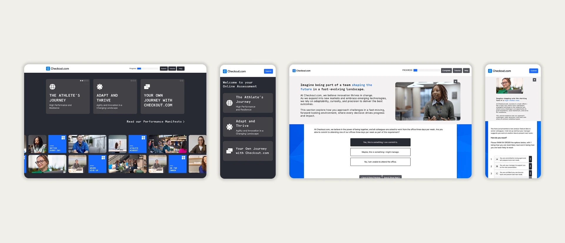
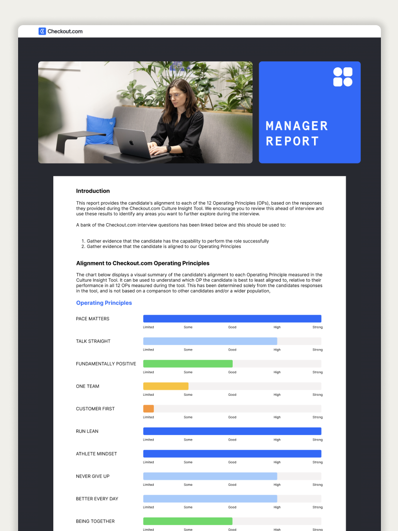
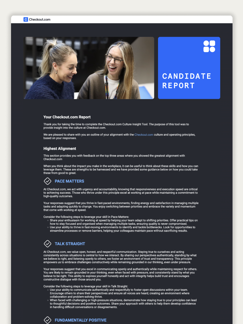
An end-to-end candidate assessment experience created for Checkout.com, from login through to assessment and feedback. This was a new client and one of my first projects within fintech.
The challenge
Translate Checkout.com's developing new brand across the assessment experience while creating something engaging for university leavers interested in fintech careers.
The client's new brand was still evolving during the project, so visual decisions frequently needed discussion and iteration.
Research and discovery
Discussions with the Talent Acquisition team helped establish the intended candidate audience, recruitment objectives and requirements for the assessment experience.
Candidates needed a clear assessment journey with straightforward instructions and feedback.
Design process
Initial mockups were created following stakeholder discussions and then iterated collaboratively with the client.
Operating Principles: a content problem
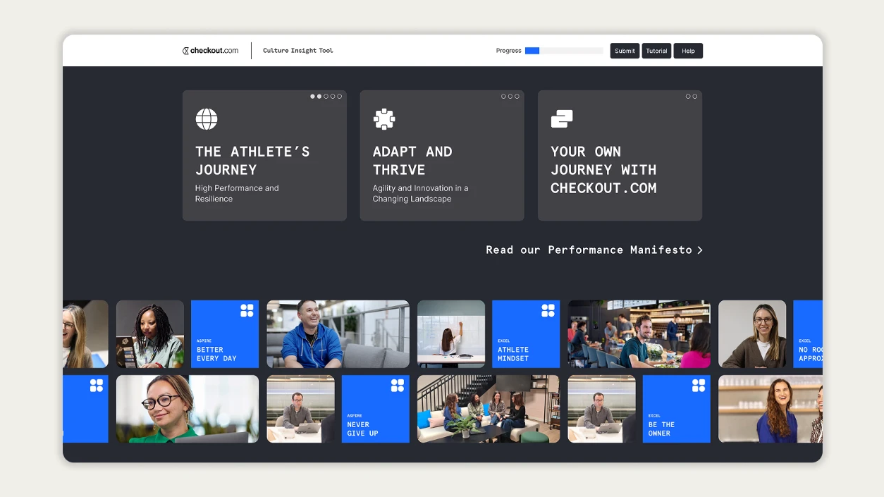
Checkout.com wanted its Operating Principles to have a prominent presence on the homepage. With more than 20 principles to communicate, presenting them as a conventional list would have created a dense and visually heavy experience.
I explored ways to give the principles prominence without allowing them to dominate the page. The final solution used an animated background treatment to surface the principles while keeping the primary content and navigation clear.
Accessibility
- Colour contrast checked against WCAG requirements
- Responsive layouts designed across desktop, tablet and mobile
- Interaction states
- Clear information hierarchy
Working with engineering
I worked closely with the engineering team during implementation, using Figma comments as part of the design and development workflow.
The project went through more iterations than usual because the brand itself was evolving. Where possible, I kept communication transparent so expectations remained aligned between the client and delivery team.
Final solution
A distinctive candidate journey that successfully reflected Checkout.com's brand while maintaining clarity and usability across the recruitment and assessment process.
What I learned
The project reinforced the importance of collaboration across design, project management and engineering. It also demonstrated the value of being able to explain design decisions clearly while knowing when the wider project team needs to challenge or push back on a requirement.