01 — Aviva
Aviva Preparation Plus
UX/UI·Information Architecture·Accessibility
- Client
- Aviva
- Role
- UX/UI Designer
- Responsibilities
- Information architecture, layout, interaction design, UI
- Collaboration
- Front-end developer, Aviva stakeholders
- Project type
- Candidate preparation product
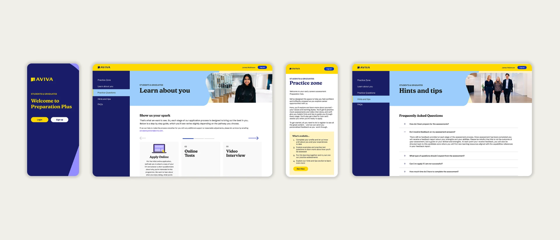
A new candidate preparation experience designed to help applicants understand and prepare for Aviva's apprenticeship recruitment process.
The challenge
Candidates needed clearer information and better preparation before entering the assessment process. Previous campaigns had experienced candidate drop-off, while applicants lacked a clear understanding of what to expect.
The product also needed to introduce Aviva's updated branding.
Stakeholder discovery
Direct user interviews weren't possible within the project budget, so I used stakeholder interviews as a proxy source of insight. I spoke with multiple Aviva stakeholders with experience of previous apprenticeship campaigns to understand candidate behaviours, pain points and areas of drop-off.
These conversations highlighted recurring issues around candidate drop-off, uncertainty about the assessment process and a lack of clear information before candidates entered it.
Candidates needed clear, accessible information and useful resources that would help them understand and progress through the recruitment journey.
Constraints
- Tight delivery deadline
- No budget for direct user interviews
- Existing technical platform constraints
These constraints meant I needed to validate ideas quickly, involve stakeholders throughout the process and work closely with development to avoid technically unfeasible solutions.
Wireframes and process
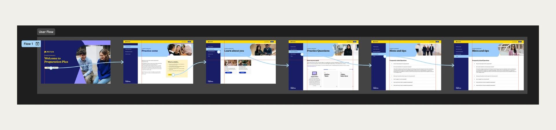
I created low-fidelity wireframes to establish the information architecture and page structure, sharing them early with the front-end developer to identify technical constraints. Once we had agreed a technically feasible structure, I progressed the designs into high-fidelity UI and interactive prototypes for client review.
Key design decisions
- Simple navigationI limited the number of navigation options to keep the experience focused and make it easier for candidates to find preparation resources.
- Consistent page structureRepeated layouts and content patterns helped candidates understand how to navigate the experience.
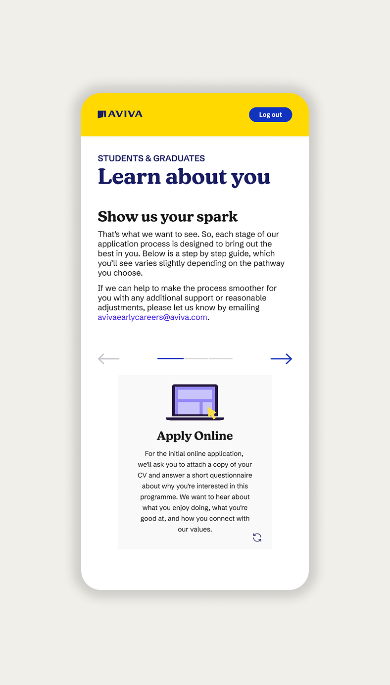
- Progressive disclosureFlip-card interactions allowed additional information to be revealed without presenting candidates with long, dense pages.
- Clear hierarchyContent was structured around the information candidates needed most at each stage of preparation.
An early concept used a floating navigation bar at the top of the page. Following iteration, this became a persistent panel on the left, making navigation more visible and predictable.
Accessibility
Accessibility was considered throughout, rather than checked at the end.
- Colour contrast checked against WCAG requirements
- Heading hierarchy and content structure considered for assistive technology
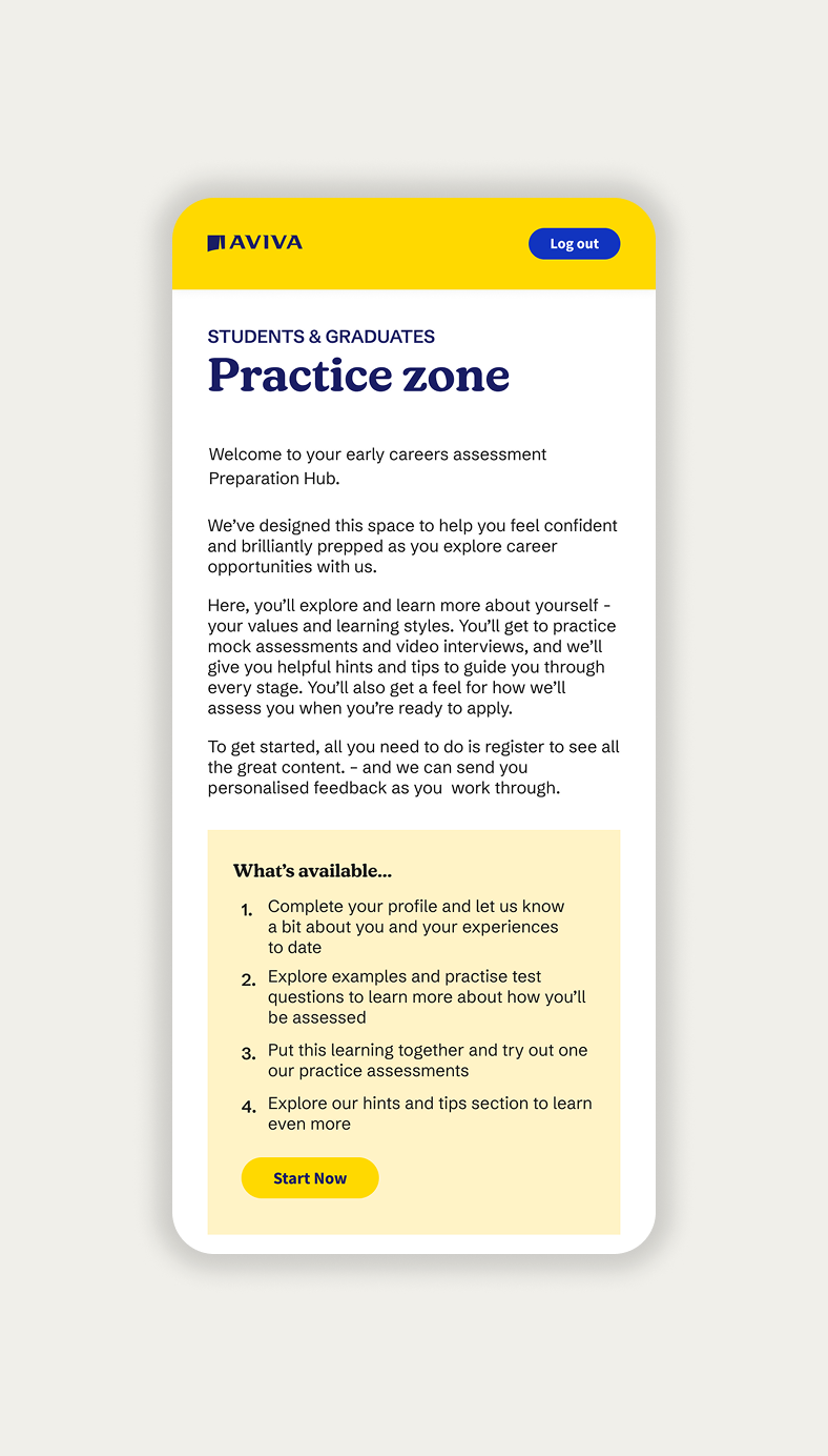
- Responsive layouts designed across desktop, tablet and mobile
- Interactive elements designed with predictable behaviour
Working with stakeholders and developers
Because direct user interviews were not available, stakeholder insight became particularly important. I shared early concepts with stakeholders and development throughout the project, allowing feedback and technical constraints to influence the design before high-fidelity work was completed.
I worked closely with the front-end developer throughout the process to understand technical limitations and make practical design decisions.
Final solution
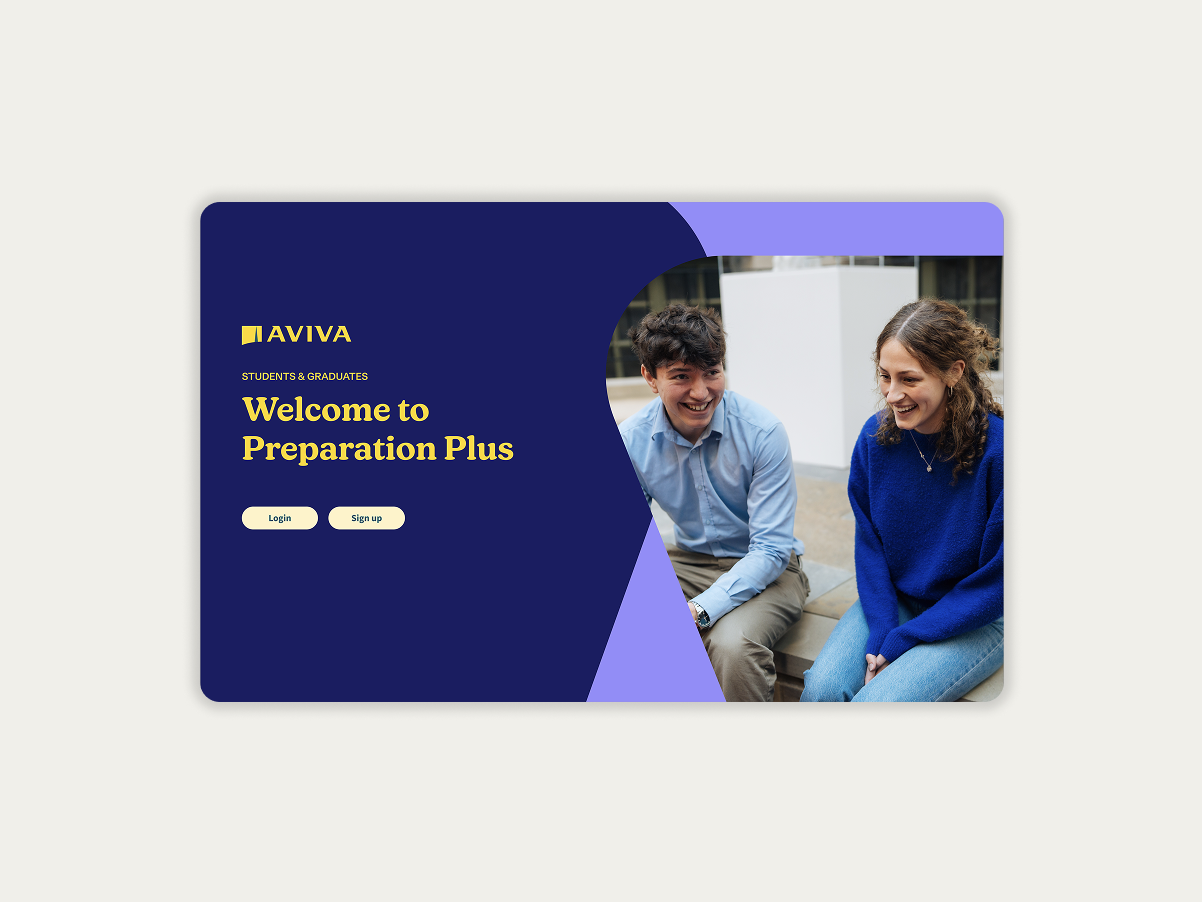
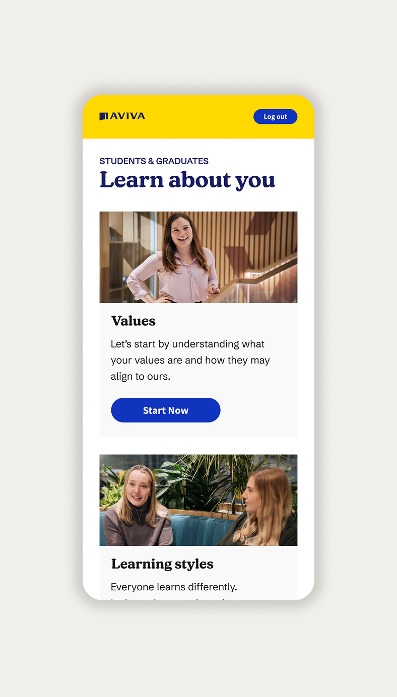
The final experience gave Aviva apprenticeship applicants a clearer way to understand the recruitment process and access preparation resources, while introducing the updated Aviva visual identity.
Outcome
- 93% assessment completion rate
- High-fidelity prototype and complete interactive specifications delivered for development
- Reusable UI components created to support future recruitment experiences
- Positive client feedback and rapid sign-off
What I learned
Close collaboration with developers early in the design process can significantly improve efficiency, particularly on projects with tight deadlines.
The project also reinforced that when traditional user research is unavailable, knowledgeable stakeholders can still provide valuable evidence, as long as their feedback is treated appropriately rather than assumed to represent users directly.